The Uninsured Map Is Really a Policy Map
MAP SO HARD · June 29, 2026
A six-to-one gap is not a rounding error
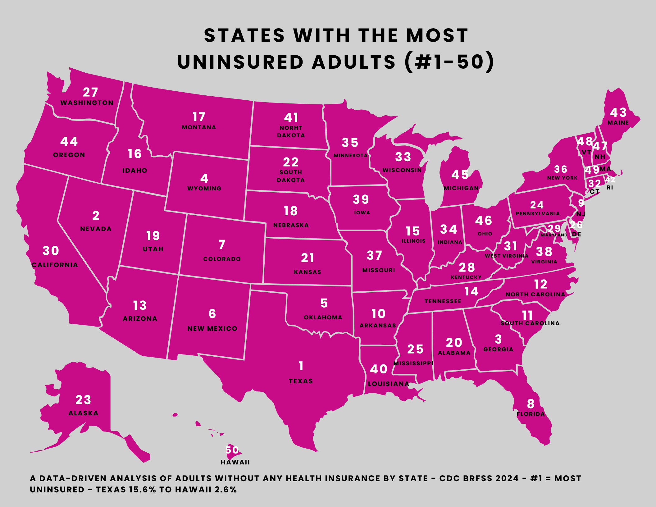
Most of our maps spread the 50 states across a band you can squint at and call "a range." The uninsured map does something different. At the top, Texas reports 15.58% of adults with no health coverage. At the bottom, Hawaii reports 2.57%. That is more than a six-to-one gap between first and last — one of the widest spreads in any map we've published. When the leader laps the trailer six times over, you are no longer looking at a metric that drifts a little from place to place. You are looking at something that breaks sharply along a line, and the interesting question is where the line is drawn.
Start with the company Texas keeps at the top. After Texas come Nevada (13.99%), Georgia (12.34%), Wyoming (11.31%), Oklahoma (10.93%), New Mexico (10.89%), Colorado (10.34%), and Florida (10.33%). That is not a tidy regional cluster. It mixes the Sun Belt, the Mountain West, and the Plains; it pairs fast-growing, relatively prosperous states with smaller, lower-population ones. Whatever these eight share, it is not a single climate, a single economy, or a single census region.
Wealth doesn't draw this map cleanly
The tempting story is that the uninsured map is just a wealth map upside down — poorer states at the top, richer states at the bottom. The data resists that as a clean explanation. Colorado, which lands at #7 (10.34%), is not a state anyone files under "poor." Sitting next to New Mexico (10.89%) and Wyoming (11.31%) in the same neighborhood of the ranking, it suggests that household income alone isn't deciding who shows up near the top. Plenty of working adults in a high-cost, high-income state can still fall into a gap where no affordable coverage pathway exists for them.
So if it isn't purely wealth, what is it? The association that researchers and analysts most often point to is policy — specifically, whether a state expanded the eligibility rules that determine who can get publicly supported coverage. Many of the states sitting highest on this map are ones widely described as not having expanded Medicaid eligibility, a choice that tends to leave more low-income, working-age adults — the people who earn too much for older programs but too little to comfortably buy a plan — without an obvious route to coverage. We want to be careful here: this is a widely-noted association, not a proven cause, and we are not assigning a specific share of any state's number to any specific decision. We don't have that figure, so we won't invent one. But it's hard to look at the spread and conclude that geography and income are doing all the work while policy does none.
The bottom of the map sharpens the point. Hawaii (#50, 2.57%) and Massachusetts (#49, 3.31%) both have long-standing arrangements aimed at near-universal coverage, and both sit far below everyone else — Vermont, the next state up at #48 (4.66%), is already nearly double Hawaii's rate. When the three lowest-uninsured states are also states known for distinctive, durable coverage structures, the simplest reading is that what a state decides to build may reflect itself directly in how many of its residents go uncovered.
What the number does and doesn't say
It's worth being precise about what this metric measures. It is the share of adults reporting no health insurance in the CDC's 2024 survey — a snapshot of who lacked coverage when asked, not a measure of how good that coverage is, how much it costs, or how often it gets used. A state could have a low uninsured rate and still leave people with expensive, thin plans; a high rate doesn't tell you anything about the quality of care for those who are covered. Treat the map as a map of access to a coverage pathway, not a verdict on a state's whole health system.
One cross-map note keeps the human cost in frame. Hawaii, the state with the lowest uninsured rate on this map, is also #1 for the highest electric bills at $212 a month. Affordability isn't one number — a household can be reliably insured and still squeezed hard somewhere else in the budget. That same caution applies across our behavioral and economic maps: a state that ranks well on most adult smokers or most vapers isn't automatically winning everywhere, and a high rank on the most uninsured map doesn't define a state any more than the price at the pump on our most expensive gas map does. Each map answers exactly one question, and this one's answer is unusually loud: the line between covered and not is drawn less by how rich a state is than by what it decides to do.
Source: the share of adults without health insurance comes from the CDC's Behavioral Risk Factor Surveillance System (BRFSS), 2024 (Tennessee uses its 2023 value where 2024 was not reported, disclosed per row). Rankings are ordinal, with ties broken alphabetically by state. The numbers are CDC's; the rankings and analysis are ours.